A More Seamless Workflow: Style Guides For Better Design & Development
May 12, 2016 Loading...
This post was recommended by Brad Frost, and featured on multiple publications
Style guides can give many benefits to the entire workflow, from design right through to build.
In short…
During the design phase style guides encourage consistency in the visual identity and help keep the interface system as logical as possible, which makes for a better UX.
During the development phase they streamline the transition from design to development as they minimise build errors and help encourage modular development best practices.
Further to this, style guides can be converted into living front end style guides which help make future updates and site maintenance more manageable due to a cleaner, more modular and structured codebase.
As a bonus both the style guide and living front end style guide can be used as a project deliverable and a way to better communicate the UI identity to your team and your client.
Designing interfaces
When designing an interface it needs to be consistent and logical. We need to create a clear taxonomy with appropriate affordances to give the best user experience (UX). Or put simply, the interface needs to make sense.
When we design an interface we aren't designing pages, or panels, we are creating a design system of elements and components that will be used in various combinations. If we keep this in mind we can create a truly fluid and flexible interface system.
We can use style guides to abstract and breakdown our designs into modular scalable elements and components, that can work together to form a congruous system.
When interfaces aren't thought of as a design system we can end up with messy and inconsistent interfaces that are very confusing for the user:
What is a style guide?
A style guide clearly demonstrates how all interface elements and components are to be visually represented. It’s essentially a master reference for the user interface (UI).
It’s worth mentioning that style guides can go by many names, such as style tiles, interface inventories and pattern libraries. There will no doubt several new terms to describe a style guide by the time this blog post is published!
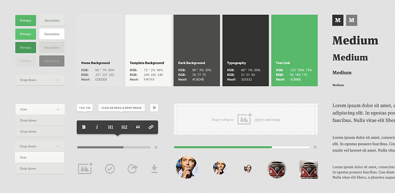
Here is a small example of the Medium.com style guide when it was first launched (taken from a Teehanlax case study):

As you can see it shows the various interface elements such as buttons, drop downs, typography hierarchy, tooltips, colour palette etc. At a glance you instantly get a taste for the visual identity of the interface. You might notice this doesn't appear to have all the interface elements used on their website, but it’s a good example.
Style guides are vital for keeping the visual identity of an interface consistent and they can be beneficial both internally, to your team, and externally, to anyone working with your brand or interface.
We can utilise Atomic Design principles to enhance this approach. Atomic Design breaks down this design system axiom and gives us the core principles to make creating design systems as clear and simple as possible.
What is atomic design?
“Atomic Design is a methodology used to construct web design systems.” — Brad Frost
Atomic Design starts from the ground up. It begins with designing base elements like form labels, inputs, paragraphs, headings and buttons. Then groups of base elements form components, groups of components form templates and groups of templates form pages.
Atomic Design in one GIF:
The great thing about Atomic Design is that you don’t have to follow it to the letter. We don’t have to give elements and components names like atoms and molecules, but we can take these core principles and apply it to designing a clear and concise style guide.
Why use a style guide?
Style guides give us the following benefits:
- Encourages designers to think about the interface as an organic, scalable and flexible system.
- Encourages consistency in the visual identity and helps keep the interface taxonomy/system as logical as possible, leading to a better UX.
- Makes designing interfaces more methodical and component based.
- Helps to quickly communicate the interface identity to other people on the team or to your clients.
- Gives us an holistic view and makes it easy to spot any incongruous interface elements.
- Makes it very clear for a developer to pick up and begin building.
- Beneficial for clients, both as a project deliverable and as stream of communication.
Overall, if we approach interface design with style guides in mind they will help us create consistent, more user friendly, interfaces as they make designing more methodical and clear which will lead to a better experience for users.
Designers already do this
A good designer will no doubt already be thinking of interfaces in this way, however, using a style guide helps better communicate the interface identity and UX to others. The designer may know why a certain colour is used for certain button actions, but that isn't much good if no one else knows why. Having a style guide helps others to have a better understanding of the UI and rationale the designer has used.
Style guides take no more time
It requires very little time to make a style guide. A good designer will have already problem solved any interface issues, established a hierarchy of elements and how they are used, so moving these elements into a style guide requires little time. Even for the smallest of projects style guides can be beneficial.
So how do style guides bridge the gap between design and front end development?
When a developer is given a web design or app to build they are often supplied design files containing page designs of the website or app. They need to interpret this design, analysing and planning the build thoroughly, identifying interface elements and components, attempting to understand the UI taxonomy. Essentially attempting to understand the design system.
But, hasn't the designer already done this?
Ideally the designer will have approached the design with all these interface elements in mind. They will have already determined what a primary call to action looks like, what colours are to be used for specific types of button actions, what font size changes occur at different screen sizes, and how layouts change for components at different screen sizes.
If the developer has to analyse and interpret the interface, then time is being wasted. Further to this, mistakes can be made and nuances can be missed when the developer is trying to understand the design.
Be it consciously or not the designer will have already created the design system that the developer is trying to build, and that design system needs to be communicated clearly.
I'm sure every developer has built a component only to have the designer mention how that’s not how they intended it to work, or behave. Style guides help improve communication of the interface and help avoid errors during the build process.
How do style guides help front end development?
Using style guides in the design phase streamlines the transition to build. Ideally designers and developers should be communicating regularly, however, if a designer can hand a clearly designed style guide, for a new website or app, to a developer the developer can then quickly see all base elements and components. They can then build quickly and methodically with as little confusion or uncertainty as possible.
Style guides work seamlessly with modern front end guidelines and component based CSS structures, such as BEM, CSS guidelines and Inverted Triangle CSS as they share the same principles — first building or designing base elements, then building or designing more complex, reusable components.
This means our style guide can be transferred easily into clean, modular, component based CSS! Like a glove!

At this stage all the developer has to do is build the style guide in HTML and CSS, creating a front end style guide.
Here are some examples of front end style guides: Codepen Code For America by Clearleft Mozilla Firefox
One small problem…
Keeping the front end style guide consistent with the code used on the live website can be tricky. If we need to update the markup of a component, and this component exists in the front end style guide and on the website, as entirely separate pieces of code, we are creating more work for ourselves. As a result the front end style guide might be neglected, not being updated as it should be and fall into disrepair.
We can solve this issue using markup templating with tools like handlebars, dust.js, or twig. These tools allow us to output markup where we like, but they are always linked from one source. This allows us to create a living front end style guide.
Living front end style guides
A living front end style guide is the same as a front end style guide, but the elements and components it displays are an exact representation of what is used, or will be used on the pages of the live website or app.
If I were to update a button element by changing its markup or CSS, that change would be reflected instantly on the website or app.
Why use a living front end style guide in development?
We can see the benefits of style guides during the design phase, but why create a ‘live’ code version of our style guide, why create a living front end style guide? They help in the following ways:
- Makes building websites more methodical and component based.
- Encourages modular, component based CSS for a cleaner, thus faster, codebase.
- Makes for easier responsive testing and general debugging.
- Allows us to utilise Atomic Design principles in development.
- Modularises code which makes it easier to reuse markup and CSS on other projects.
- Having all interface elements ‘living’ on one page makes updates and redesigns easier.
- Allows interface inconsistencies to be easily and quickly identified.
- Allows us to check that all components can work together on one page without any code conflicts.
- Provides a master page for markup and user interface reference.
- Can be used as a client and project deliverable.
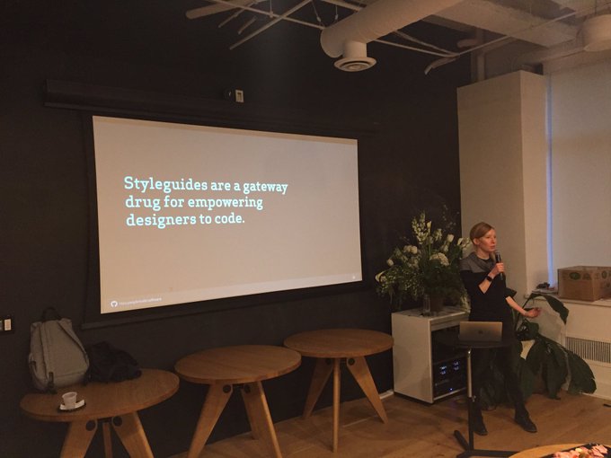
As a bonus, front end style guides can sometimes help non-code savvy designers begin to see how they might start to code -
Wrap up — style guide driven workflow
Style guides and living style guides have helped streamline and focus my workflow.
During the design phase they help identify interface inconsistencies and help to remind me that interfaces are flexible design systems. During the transition from design to development they help minimise mistakes and speed up the handover. At the development phase style guides can be built into HTML and CSS seamlessly as they share major principles with front end guidelines and component based CSS structures. Using living style guides then make updates and redesigns as easy and manageable as possible.
Hopefully a style guide workflow can benefit you as well, but as always with all things web and design, there are a thousand ways to approach a project. If you’ve found a workflow that works for you, keep using it!
Additional links:
Sales Force — Lightning Design System
Anna Debenham — Style Guides
Samantha Warren - Styletiles
Brad Frost — Patternlab
If you like React, Next.js or front-end development in general, feel free to follow and say hi on Twitter @AshConnolly_! 👋 🙂
